
Holiday time and holiday photos time, a precious memory that however is not always up to our expectations, because of blurry photos or unrealistic colors. Here is a tutorial to learn how to correct holiday photos with Photoshop.

Follow FullPress on Google
Add us to your preferred sources.

TTutorial to learn how to correct vacation photos with Photoshop.
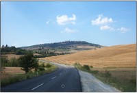
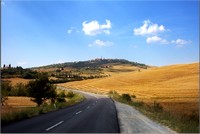
- We took this photo near Pienza, in Tuscany. It’s undoubtedly a great framing, but unfortunately, partly due to the dull color, partly due to the general lighting, it looks sad and plain, vaguely reminding us of those postcards that become old and faded because no one wants to buy them. For a better understanding of the camera, we refer to the photography course.

- Professional photographers usually use gelatin filters, thin colored films mounted in front of the camera lens to achieve special chromatic effects. Now let’s see how to reproduce this technique digitally, with our Photoshop, isolating each chromatic effect on a separate layer, so as to even gain more control than traditional filters.
- The first thing to do is to correct the color range. So let’s go to the Levels palette and click on the New Fill or Adjustment Layer icon. We can also apply the command by going through the Image > Adjustments > Levels… menu, but this way we keep the original image unchanged and can modify the values at any time.
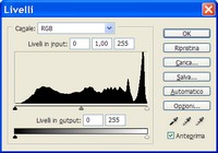
- This tool allows us to correct the tonal range and color balance by adjusting the levels of light, midtones, and shadows intensity. We use the three eyedroppers to set the black, white, and gray points of the photo, then compress the input levels to increase contrast and brightness.
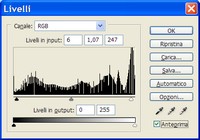
- As we can see in the figure above, even with this simple (but fundamental) operation, we have completely changed the entire look of the photo, restoring the warmth and brightness that the landscape had when seen live. But let’s go further: what we want is to create an intense and evocative image.
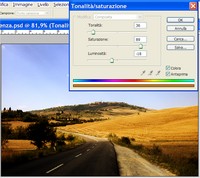
- We create a new adjustment layer, this time selecting Hue/Saturation. A dialog box appears asking for the layer name and the Blending Mode. We assign the name Blue Filter, blending mode Soft Light, and click Ok. A new dialog box opens, Hue/Saturation, as shown in the figure, where we activate the Colorize control.
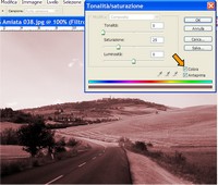
- We slide the handles until we get the color we want; in our case, we set the values to Hue 245, Saturation 100, and Lightness -25. We have thus created our digital filter. Unlike traditional ones, however, it has the Lightness slider that functions as a gamma control, allowing lights and shadows to keep their original contrast values.
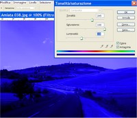
- We click on the mask of the Blue Filter layer and activate the Gradient tool. We press D to set the default colors and select the Foreground to Background gradient. Holding down the Alt key (which allows us to draw a straight line), we drag from the center of the photo to about halfway to the first cloud, so that the masked part is the lower one.
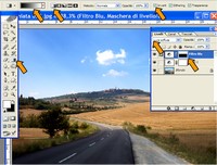
- At this point, if necessary, we can make further adjustments in the Hue/Saturation window simply by double-clicking the layer. In our case, we further lowered the Lightness to -80. As we can notice, this operation, besides giving a dramatic look to the sky, also highlighted many details.

- However, we must ensure that the small village on the horizon is not affected by the filter. So we activate the Magic Wand tool and begin selecting the sky above the horizon. Then we activate the Rectangular Marquee tool, add the rest of the sky by dragging while holding down Alt. We go to the Select menu > Inverse and fill the selection with black in the mask.
- In the same way we applied a blue filter to emphasize the sky, now we apply a golden filter that increases the brightness and warmth of the wheat fields. Immediately create a new Hue/Saturation adjustment layer, blending mode Soft Light, and name it Golden Filter. Set the values Hue 36, Saturation 89, and Lightness -18.
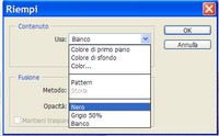
- Now activate the mask of the layer. This time we proceed slightly differently from before. We go to the Image menu > Fill. A dialog box will open. We select Black from the drop-down menu and press Ok. With this operation, we have “darkened” the layer mask, completely hiding the adjustments made to the Hue.
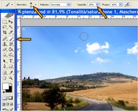
- We activate the Brush tool, set a size of 50 pixels, reduce Opacity to 20%, and, if it is not already set, set white as the Foreground color. We start painting the areas of the photo covered by the fields. The low opacity will allow us to adjust the intensity with which the filter is shown to create nice gradients.
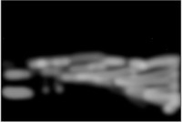
- What we see in the figure above is the mask of the Golden Filter layer after applying the brush strokes. To view it, just click on the mask while holding down the Alt key. As we can see, the brush strokes were not applied evenly, but this is not a fixed rule; it depends on both the type of image and our preferences.
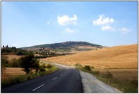
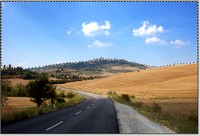
- And here is the finished image. Any adjustment made and any tool applied can be modified again simply by opening the respective dialog boxes by double-clicking on the layer. This is indeed the great advantage of adjustment layers, besides keeping the original unchanged. Wonderful, isn’t it?
Be the first to comment