
Some tricks to fix poor image readability and blurry photos with Adobe Photoshop CS: from applying filters to checking hue, saturation, brightness, and contrast.

Add us to your preferred sources.

Some tricks to remedy poor image readability and blurry photos with Adobe Photoshop CS: from applying filters to checking tone, saturation, brightness, and contrast.
Through the features of Adobe Photoshop CS, it is possible to correct blurry images that are poorly readable because they were badly shot with a camera or badly printed during development. There are numerous correction methods. Two distinct methods, suitable for different situations, will be presented.

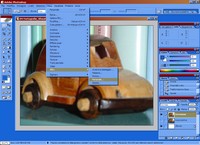
The first method uses a filter. From the Filter menu, select Other and then Custom. With this, it is possible to change the brightness values of each pixel in the image based on a predefined mathematical operation called “convolution.” Each pixel is reassigned a value based on those of the surrounding pixels.
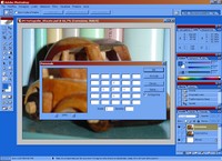
The grid that appears in the Custom window gives an idea of the brightness variation of pixels surrounding a certain color. Applying the filter increases the contrast of the entire image. This operation is similar to the Add and Subtract calculations for Channels. If the effect obtained is still too subtle, it can be strengthened by applying a subsequent filter.
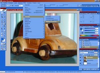
To improve the result obtained with the Custom filter, some contrast effects can be applied. From the Filter menu, choose Sharpen and then Unsharp Mask. This feature allows working on the resolution of micro-areas, in order to accentuate the brightness variation between pixels and surrounding pixels, creating greater sharpness.
In the Unsharp Mask dialog box, it is advisable that Preview is selected. By moving the Amount slider to the right, the contrast of the edges increases. For high-resolution images (above 200 Dpi), usually an amount between 150% and 200% is sufficient. Grainy images, however, require a lower setting.
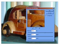
To increase the width of the edges generated in the previous step, the Radius slider can be used by dragging it to the right. A setting between 1 and 2 is generally adequate. When the setting is too high, the edges acquire visible halos and the image’s level of granularity increases. Values greater than 2 are recommended only with high-definition images.
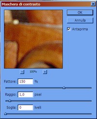
With the Threshold slider, instead, it is possible to increase the difference between tones before the filter sharpens the borders between them. A threshold of zero affects all pixels in the image. A high threshold highlights edges only between significantly different tones. Generally, values between 2 and 20 are satisfactory. To calibrate the effects well, it is advisable to try mixing the three controls before clicking Ok.
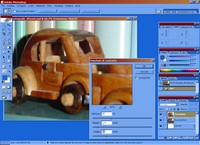
All the steps described so far concern blurry photographs. There are, however, images that are also not sharp from the grain perspective. A classic example is photos taken with digital cameras and saved at low resolution, or small images then enlarged. Both accentuate pixel granularity and need correction.
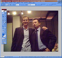
For the modifications to be effective, it is necessary to increase color depth, switching from the default mode to Cyan, Magenta, Yellow, and Black mode. For this, choose the CMYK Color option from the Image > Mode menu. Once all necessary edits are made, the image can be reverted to the original depth.
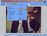
To “save” these images, changes can be made to the color range, brightness, saturation, and contrast. One can start, for example, by adjusting color levels with Image > Adjustments > Auto Levels. If you want to work in detail instead, pressing CTRL + L lets you adjust the three RGB channels individually at a manual level.
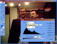
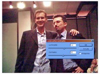
It is possible that this operation results in a very contrasted image in which some details are lost. To adjust light and contrast, it is advisable to use the Brightness/Contrast function from Image > Adjustments. By trying different settings, the image can be shifted toward greater sharpness, bringing out details.
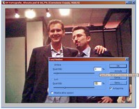
Similarly, internal lights and shadows within the image can be adjusted to balance hidden parts and those still under-illuminated. To act on these two values, the Shadows/Highlights function can also be used, accessible from Image > Adjustments. The quantities of lights and shadows are expressed as a percentage relative to those in the original.
At this point, it’s left to retouch the color saturation which an overly contrasted exposure might have ruined. Calling up the Hue/Saturation function with CTRL + U or from the Image > Adjustments menu, you can reduce some color from the overall image if it appears too rich. It’s good to make some tests before pressing Ok.
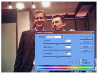
Saturation changes can also be made selectively. If in the Edit dropdown menu inside the Hue/Saturation window you choose one of the six available colors (Reds, Yellows, Greens, Cyans, Blues, Magentas), you can correct each single color saturation. In the illustrated example, it was appropriate to lower the saturation of yellows.
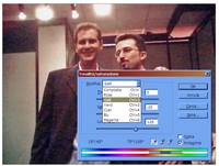
Now it remains to evaluate the image as a whole. It is evident that it is not possible to fix the defects of every image, particularly the excessive pixelation. Images with initially too low resolution are often at risk. The goal, however, must be to increase sharpness without losing details.
Recommended web pages xnxxyouporn.com, romeoporno.com, xnxxit.com, broporno.org, zzzporno.org, xxx1.link.
Be the first to comment